Colours
Primary palette
The primary palette includes colours used in the main interface chrome, interaction elements and states.
Vivid Blue
#1733F0
23, 51, 240
Dark Blue
#030D4F
#, #, #
Grey
#686D8F
#, #, #
Blues
100
#F5F6FE
200
#EAECFE
300
#E0E4FF
400
#C2CAFF
500
#8D9CFB
600
#5C71F9
700
#1733F0
800
#0B1E9B
900
#030D4F
Greys
100
#FCFDFF
200
#FAFBFF
300
#F5F6FA
400
#ECEDF5
500
#BCC0D6
600
#686D8F
700
#484C65
800
#2B2E3E
900
#101119
Traffic Light Colours
Success
100
#347D00
200
#569629
300
#EDFFE0
400
#F9FFF5
Warning
100
#CC6600
200
#EC8824
300
#FFE8D1
400
#FFF7F0
Errors
100
#800000
200
#B20000
300
#C22121
400
#D69F9F
300
#EDC2C2
400
#F7E9E9
Information
100
#00117D
200
#293796
300
#C2C8ED
400
#E9EAF7
Chart Colours
TBC
Typography
Fonts
Aa
ABCDEFGHIJKLMNOPQRSTUVWXYZ
abcdefghijklmnopqrstuvwxyz
1234567890 (,.;:?!£&*"%)@
Ubuntu
Aa
ABCDEFGHIJKLMNOPQRSTUVWXYZ
abcdefghijklmnopqrstuvwxyz
1234567890 (,.;:?!£&*"%)@
Secular One
Headers
Establish a visual and semantic hierarchy by nesting headings correctly. For example, an H3 follows an H2 when it denotes a section contained within the H2's content.
| Tag | Example | Style | Guideline |
| <h1> | Page title |
font-family: 'Secular One',sans-serif font-size: 60px font-weight: normal |
The main page heading is an H1 element. You should only use it once per page. |
| <h2> | Heading |
font-family: 'Secular One',sans-serif font-size: 36px font-weight: normal |
The secondary heading to the left is an H2 element, which may be used as a page-level heading. More than one may be used per page. |
| <h3> | Third-level heading |
font-family: 'Secular One',sans-serif font-size: 24px font-weight: normal |
The heading to the left is an H3 element, which may be used after an H2 heading in the document hierarchy. |
| <h4> | Fourth-level heading |
font-family: 'Secular One',sans-serif font-size: 20px font-weight: normal |
The heading to the left is an H4 element, which may be used after an H3 heading in the document hierarchy. |
| <h5> | Fifth-level heading |
font-family: 'Secular One',sans-serif font-size: 16px font-weight: bold |
The heading to the left is an H5 element, which may be used after an H4 heading in the document hierarchy. |
| <h6> | Sixth-level heading |
font-family: 'Secular One',sans-serif font-size: 12px font-weight: bold |
The heading to the left is an H6 element, which may be used after an H5 heading in the document hierarchy. |
General text formatting
| Tag | Example | Style | Guideline |
| Regular text |
font-size: 14px font-weight: normal |
TBC | |
| <b> | Bold text |
font-size: 14px font-weight: bold |
TBC |
| <i> | Italic text |
font-size: 14px font-style: italic |
TBC |
| <p> | Paragraph text |
font-size: 14px font-weight: normal |
TBC |
| <small> | Small text |
font-size: 12px font-weight: normal |
Small text is used primarily as help text under form fields and as secondary supporting text in applications. Use sparingly. |
Lists
| Tag | Example | Style | Guideline |
| <ol> |
|
font-size: 14px font-weight: normal |
Use ordered lists to semantically group items in a pre-determined order. |
| <ul> |
|
font-size: 14px font-weight: normal |
Use unordered lists to semantically group related items. |
Quotes
| Tag | Example | Style | Guideline |
| <blockquote> | blockquote |
font-size: 14px font-weight: normal |
TBC |
| <q> | Inline quote |
font-size: 14px font-weight: normal |
TBC |
| <code> |
<div class="foo">
|
font-size: 12px font-weight: normal |
TBC |
How to use
1. Reference the RightMarket front-end framework
							<!-- Latest compiled and minified RightMarket front-end framework -->

							<link rel="stylesheet" href="https://ui.rightmarket.com/framework.min.css">
2. Use any tag highlighted below:
							<h1>example</h1>

							<h2>example</h2>

							<h3>example</h3>

							<h4>example</h4>

							<h5>example</h5>

							<h6>example</h6>


							<b>example</b>

							<i>example</i>

							<p>example</p>

							<small>example</small>


							<ol>example</ol>

							<ul>example</ul>


							<blockquote>example</blockquote>

							<q>example</q>

							<code>example</code>
Iconography
Usage
When to use icons:
- Icons should only ever be used in relation to a function (e.g. Search, Edit, Settings)
- Icons can be used to indicate short term status (Basket with number, loading, or delivery offered)
When not to use icons:
- Do not use icons for sign posting unless absolutely necessary - the new brand is all about simplification
- Do not use icons to illustrate a process or abstract concepts, please use photography, a text solution or the brand illustration style (currently in development)
- Icons should NOT be used for sizes larger than 60x60 pixels
How to use (Default)
To reference an icon add the icon name to the following path:
https://ui.rightmarket.com/icons/warning.svg
Click here to see the full list of icons.
To use an icon as a background image:
1. Reference the RightMarket front-end framework
							<!-- Latest compiled and minified RightMarket front-end framework -->

							<link rel="stylesheet" href="https://ui.rightmarket.com/framework.min.css">
2. Use the class highlighted below:
<span class="rmui-icon-warning"></span>
Icons
 vertical-double-arrow |
 compress |
 compress-square |
 double-arrow |
 down-arrow-2 |
 down-arrow-3 |
 down-arrows |
 exchange |
|
 expand-arrows |
 expand-arrows-1 |
 expand-square |
 insert |
 left-arrow-2 |
 left-arrow-3 |
 left-arrows |
 move-arrows |
|
 move-right |
 random |
 recycling |
 resize |
 resize-1 |
 retweet |
 right-arrow |
 right-arrow-3 |
|
 right-arrows |
 sign-in |
 sign-in-1 |
 sign-out |
 sort |
 up-arrow |
 up-arrow-2 |
 up-arrows |
|
 user-checked |
 users |
 user |
 user-and-clock |
 user-card |
 calendar-1 |
 calendar |
 paper-plane-1 |
|
 at |
 envelope |
 envelope-1 |
 inbox |
 mail-box |
 open-envelope |
 open-envelope-1 |
 outbox |
|
 paper-plane |
 comments |
 conversation |
 conversation-1 |
 frown-face |
 heart |
 heart-1 |
 left-half-star |
|
 right-half-star |
 smile |
 smiley |
 star |
 star-1 |
 star-half-filled |
 star-half-filled-1 |
 thumb-down |
|
 thumb-down-1 |
 thumb-up |
 thumb-up-1 |
 affect |
 chat |
 comment |
 commenting |
 commenting-1 |
|
 zip-file |
 blank-file |
 clipboard-1 |
 clipboard-2 |
 copy-file |
 copy-file-1 |
 file |
 file-code |
|
 folder |
 folder-1 |
 font-file |
 open-folder |
 open-folder-1 |
 picture |
 picture-file |
 play-file |
|
 presentation |
 presentation-file |
 processing-file |
 refresh-file |
 text-file |
 text-file-1 |
 trash |
 asterisk |
|
 cloud |
 cloud-1 |
 copyright-symbol |
 crop |
 database |
 edit |
 filter |
 hash |
|
 home |
 house |
 light-bulb |
 notebook |
 paint-brush |
 palette |
 pencil |
 phone |
|
 pin |
 pointer |
 power-button |
 search |
 plus |
 add-square |
 minus |
 minus-button |
|
 three-cells-1 |
 bar-menu |
 form |
 grid |
 grid-level |
 layout |
 line-list |
 lines |
|
 list |
 list-1 |
 list-2 |
 modal-list |
 square-menu |
 square-menu-1 |
 squares |
 squares-1 |
|
 table |
 tasks |
 three-cells |
 underline |
 bold |
 bullets |
 center-align |
 computing-code |
|
 font |
 function |
 header |
 indent |
 indent-1 |
 italic |
 justify-align |
 left-alignment |
|
 link |
 object-orientation |
 paperclip |
 paragraph |
 right-alignment |
 striketrought |
 subscript |
 superscript |
|
 text-height |
 text-label |
 text-width |
 white-flag |
 flag |
 unlock |
 cogwheel |
 cogwheel-1 |
|
 info |
 key |
 key-1 |
 padlock |
 question |
 shield |
 barcode |
 youtube-1 |
|
 facebook-logo |
 facebook-logo-on-square |
 google-plus-logo |
 google-plus-logo-1 |
 rss |
 rss-square |
 twitter-logo |
 twitter-logo-1 |
|
 youtube |
 volume-up |
 fast-forward |
 microphone |
 mute-microphone |
 pause-symbol |
 play-button |
 previous-track |
|
 rewind |
 rewind-symbol |
 skip-track |
 skip-track-1 |
 sound-mute |
 speaker |
 stop |
 volume-down |
|
 volume-off |
 close |
 checked |
 check-square |
 check-square-1 |
 viewpoint |
 ban |
 eject-symbol |
|
 elipsis |
 ellipsis |
 left-quote |
 line |
 line-1 |
 qr-code |
 right-quote |
 select-area |
|
 square |
 tabs |
 upload |
 cloud-upload |
 cloud-uploading |
 download-from-cloud |
 downloading-from-cloud |
 download-symbol |
|
 warning |
 exclamation |
 order-inprogress |
 order-inprogress-static |
 order-completed |
 order-declined |
 order-await-approval |
 refresh |
|
 rotate-left |
 rotate-right |
 zoom-in |
 zoom-out |
 cancel |
How to use (White)
To reference an icon add the icon name to the following path:
https://ui.rightmarket.com/icons/warning-white.svg
Click here to see the full list of icons.
To use an icon as a background image:
1. Reference the RightMarket front-end framework
							<!-- Latest compiled and minified RightMarket front-end framework -->

							<link rel="stylesheet" href="https://ui.rightmarket.com/framework.min.css">
2. Use the class highlighted below:
<span class="rmui-icon-warning-white"></span>
Icons
 vertical-double-arrow-white |
 compress-white |
 compress-square-white |
 double-arrow-white |
 down-arrow-2-white |
 down-arrow-3-white |
 down-arrows-white |
 exchange-white |
|
 expand-arrows-white |
 expand-arrows-1-white |
 expand-square-white |
 insert-white |
 left-arrow-2-white |
 left-arrow-3-white |
 left-arrows-white |
 move-arrows-white |
|
 move-right-white |
 random-white |
 recycling-white |
 resize-white |
 resize-1-white |
 retweet-white |
 right-arrow-white |
 right-arrow-3-white |
|
 right-arrows-white |
 sign-in-white |
 sign-in-1-white |
 sign-out-white |
 sort-white |
 up-arrow-white |
 up-arrow-2-white |
 up-arrows-white |
|
 user-checked-white |
 users-white |
 user-white |
 user-and-clock-white |
 user-card-white |
 calendar-1-white |
 calendar-white |
 paper-plane-1-white |
|
 at-white |
 envelope-white |
 envelope-1-white |
 inbox-white |
 mail-box-white |
 open-envelope-white |
 open-envelope-1-white |
 outbox-white |
|
 paper-plane-white |
 comments-white |
 conversation-white |
 conversation-1-white |
 frown-face-white |
 heart-white |
 heart-1-white |
 left-half-star-white |
|
 right-half-star-white |
 smile-white |
 smiley-white |
 star-white |
 star-1-white |
 star-half-filled-white |
 star-half-filled-1-white |
 thumb-down-white |
|
 thumb-down-1-white |
 thumb-up-white |
 thumb-up-1-white |
 affect-white |
 chat-white |
 comment-white |
 commenting-white |
 commenting-1-white |
|
 zip-file-white |
 blank-file-white |
 clipboard-1-white |
 clipboard-2-white |
 copy-file-white |
 copy-file-1-white |
 file-white |
 file-code-white |
|
 folder-white |
 folder-1-white |
 font-file-white |
 open-folder-white |
 open-folder-1-white |
 picture-white |
 picture-file-white |
 play-file-white |
|
 presentation-white |
 presentation-file-white |
 processing-file-white |
 refresh-file-white |
 text-file-white |
 text-file-1-white |
 trash-white |
 asterisk-white |
|
 cloud-white |
 cloud-1-white |
 copyright-symbol-white |
 crop-white |
 database-white |
 edit-white |
 filter-white |
 hash-white |
|
 home-white |
 house-white |
 light-bulb-white |
 notebook-white |
 paint-brush-white |
 palette-white |
 pencil-white |
 phone-white |
|
pin-white |
 pointer-white |
 power-button-white |
 search-white |
 plus-white |
 add-square-white |
minus-white |
 minus-button-white |
|
 three-cells-1-white |
 bar-menu-white |
 form-white |
 grid-white |
 grid-level-white |
 layout-white |
 line-list-white |
 lines-white |
|
 list-white |
 list-1-white |
 list-2-white |
 modal-list-white |
 square-menu-white |
 square-menu-1-white |
 squares-white |
 squares-1-white |
|
 table-white |
 tasks-white |
 three-cells-white |
 underline-white |
 bold-white |
 bullets-white |
 center-align-white |
 computing-code-white |
|
 font-white |
 function-white |
 header-white |
 indent-white |
 indent-1-white |
 italic-white |
 justify-align-white |
 left-alignment-white |
|
 link-white |
 object-orientation-white |
 paperclip-white |
 paragraph-white |
 right-alignment-white |
 striketrought-white |
 subscript-white |
 superscript-white |
|
 text-height-white |
 text-label-white |
 text-width-white |
 white-flag-white |
 flag-white |
 unlock-white |
 cogwheel-white |
 cogwheel-1-white |
|
 info-white |
 key-white |
 key-1-white |
 padlock-white |
 question-white |
 shield-white |
 barcode-white |
 youtube-1-white |
|
 facebook-logo-white |
 facebook-logo-on-square-white |
 google-plus-logo-white |
 google-plus-logo-1-white |
 rss-white |
 rss-square-white |
 twitter-logo-white |
 twitter-logo-1-white |
|
 youtube-white |
 volume-up-white |
 fast-forward-white |
 microphone-white |
 mute-microphone-white |
 pause-symbol-white |
 play-button-white |
 previous-track-white |
|
 rewind-white |
 rewind-symbol-white |
 skip-track-white |
 skip-track-1-white |
 sound-mute-white |
 speaker-white |
 stop-white |
 volume-down-white |
|
 volume-off-white |
 close-white |
 checked-white |
 check-square-white |
 check-square-1-white |
 viewpoint-white |
 ban-white |
 eject-symbol-white |
|
 elipsis-white |
 ellipsis-white |
 left-quote-white |
 line-white |
 line-1-white |
 qr-code-white |
 right-quote-white |
 select-area-white |
|
 square-white |
 tabs-white |
 upload-white |
 cloud-upload-white |
 cloud-uploading-white |
 download-from-cloud-white |
 downloading-from-cloud-white |
 download-symbol-white |
|
 warning-white |
 exclamation-white |
 order-inprogress-white |
 order-inprogress-static-white |
 order-completed-white |
 order-declined-white |
 order-await-approval-white |
 refresh-white |
|
 rotate-left-white |
 rotate-right-white |
 zoom-in-white |
 zoom-out-white |
 cancel-white |
How to use (Spare)
To reference an icon add the icon name to the following path:
https://ui.rightmarket.com/icons/warning.svg
Click here to see the full list of icons.
To use an icon as a background image:
1. Reference the RightMarket front-end framework
							<!-- Latest compiled and minified RightMarket front-end framework -->

							<link rel="stylesheet" href="https://ui.rightmarket.com/framework.min.css">
2. Use the class highlighted below:
<span class="rmui-icon-warning"></span>
Icons
vertical-double-arrow |
compress |
compress-square |
double-arrow |
down-arrow-2 |
down-arrow-3 |
down-arrows |
exchange |
expand-arrows |
expand-arrows-1 |
expand-square |
insert |
left-arrow-2 |
left-arrow-3 |
left-arrows |
move-arrows |
move-right |
random |
recycling |
resize |
resize-1 |
retweet |
right-arrow |
right-arrow-3 |
right-arrows |
sign-in |
sign-in-1 |
sign-out |
sort |
up-arrow |
up-arrow-2 |
up-arrows |
user-checked |
users |
user |
user-and-clock |
user-card |
calendar-1 |
calendar |
paper-plane-1 |
at |
envelope |
envelope-1 |
inbox |
mail-box |
open-envelope |
open-envelope-1 |
outbox |
paper-plane |
comments |
conversation |
conversation-1 |
frown-face |
heart |
heart-1 |
left-half-star |
right-half-star |
smile |
smiley |
star |
star-1 |
star-half-filled |
star-half-filled-1 |
thumb-down |
thumb-down-1 |
thumb-up |
thumb-up-1 |
affect |
chat |
comment |
commenting |
commenting-1 |
zip-file |
blank-file |
clipboard-1 |
clipboard-2 |
copy-file |
copy-file-1 |
file |
file-code |
folder |
folder-1 |
font-file |
open-folder |
open-folder-1 |
picture |
picture-file |
play-file |
presentation |
presentation-file |
processing-file |
refresh-file |
text-file |
text-file-1 |
trash |
asterisk |
cloud |
cloud-1 |
copyright-symbol |
crop |
database |
edit |
filter |
hash |
home |
house |
light-bulb |
notebook |
paint-brush |
palette |
pencil |
phone |
pin |
pointer |
power-button |
search |
plus |
add-square |
minus |
minus-button |
three-cells-1 |
bar-menu |
form |
grid |
grid-level |
layout |
line-list |
lines |
list |
list-1 |
list-2 |
modal-list |
square-menu |
square-menu-1 |
squares |
squares-1 |
table |
tasks |
three-cells |
underline |
bold |
bullets |
center-align |
computing-code |
font |
function |
header |
indent |
indent-1 |
italic |
justify-align |
left-alignment |
link |
object-orientation |
paperclip |
paragraph |
right-alignment |
striketrought |
subscript |
superscript |
text-height |
text-label |
text-width |
white-flag |
flag |
unlock |
cogwheel |
cogwheel-1 |
info |
key |
key-1 |
padlock |
question |
shield |
barcode |
youtube-1 |
facebook-logo |
facebook-logo-on-square |
google-plus-logo |
google-plus-logo-1 |
rss |
rss-square |
twitter-logo |
twitter-logo-1 |
youtube |
volume-up |
fast-forward |
microphone |
mute-microphone |
pause-symbol |
play-button |
previous-track |
rewind |
rewind-symbol |
skip-track |
skip-track-1 |
sound-mute |
speaker |
stop |
volume-down |
volume-off |
close |
checked |
check-square |
check-square-1 |
viewpoint |
ban |
eject-symbol |
elipsis |
ellipsis |
left-quote |
line |
line-1 |
qr-code |
right-quote |
select-area |
square |
tabs |
upload |
cloud-upload |
cloud-uploading |
download-from-cloud |
downloading-from-cloud |
download-symbol |
warning |
exclamation |
order-inprogress |
order-inprogress-static |
order-completed |
order-declined |
order-await-approval |
refresh |
rotate-left |
rotate-right |
zoom-in |
zoom-out |
How to use (GIF)
There are several animated icons implemented in svg format. However, animated svg do not animate in IE and Edge family browsers so animated gifs are necessary. To reference an icon add the icon name to the following path:
https://ui.rightmarket.com/icons/gif/inprogress-24px.gif
Icons
 inprogress-24px |
 inprogress-48px |
 inprogress-64px |
 inprogress-96px |
inprogress-24px |
inprogress-48px |
inprogress-64px |
inprogress-96px |
Favicon
How to use
To reference the favicon use the following path:
https://ui.rightmarket.com/favicon.ico
Writing style
Our aim
With everything we write and publish, we aim to:
- Empower
Help people understand RightMarket by using language that informs them and encourages them to make the most out of our product.
- Respect
Treat readers with the respect they deserve. Put yourself in their shoes, and don’t patronize them. Remember that they have other things to do. Be considerate and inclusive. Don’t market at people; communicate with them.
- Educate
Tell readers what they need to know, not just what we want to say. Give them the exact information they need, along with opportunities to learn more. Remember that you’re the expert, and readers don’t have access to everything you know. Show them how RightMarket can transform their traditional marketing processes so marketers and sales people can get on with what they do best.
- Guide
Think of yourself as a tour guide for our readers. Whether you’re leading them through the website, blogs, or educational materials - communicate in a friendly and helpful way.
- Speak truth
Understand RightMarket’s place in our end users’ lives. Avoid dramatic storytelling. Focus on our real strengths and truths.
Voice
The RightMarket voice is impactful, conversational, and fun. We use clear language that reflects how human beings actually talk to one another. We use contractions to avoid sounding like robots, and we avoid business jargon so that we don’t sound like jerks.
We’re trustworthy guides to the world of Branded Document Automation, and we’re somebody our customers love spending time with, because we listen, we care, and we help them achieve greatness.
Our unique voice is made up of four principles that reflect the way we want to communicate with our end users.
RightMarket is:
- Expert but not bossy
- Educational without being patronizing
- Disruptive but supportive
- Fun but not childish
- Confident but not cocky
- Innovative but not unapproachable
In order to achieve those goals, we make sure that:
- We speak clearly
- We are informative
- We are friendly
- We are appropriate
Spelling
We use UK English spelling and sentence case for everything, including titles and buttons.
Be clear
Speak in the End Users language. Don’t use fancy technological jargon they won’t understand. Use a standard vocabulary with a natural tone and flow. Try to delight the user with positive phrasing as well as a conversational voice. Finally, read your copy aloud to make sure it sounds natural.
The exception to abbreviation: Abbreviation should be avoided unless you are speaking about Branded Document Automation. You can abbreviate this to BDA once you have referred to Branded Document Automation in the first instance. Then you can use the short version for all other references.
Use contractions: They’re great and give you an informal, friendly tone. This helps convey messages much better to the end user.
| Bad | Good |
| Our service is proven to drive departmental engagement and through efficiency, supercharges the productivity of existing resource, resulting in improved company performance underlined by considerable cost savings. | We are in the marketing technology sector in a new category called Branded Document Automation. RightMarket exists to help organisations improve their sales and marketing performance. |
Be Informative
Make each word, sentence, and paragraph count and spend time crafting your message to perfection. Speak in sentences, not in tiny bursts with many full stops – this comes across as grumpy and short which we don't want.
| Bad | Good |
| Contact us for a demo. | To request a demo of RightMarket, please get in contact with us. |
Be friendly & Harmonious
The language of everything RightMarket should sound like one voice, so look to examples on the team site and website to ensure consistency. Avoid difficult to understand technical jargon as much as possible. Write like a human - conversational, warm, yet informative.
Don’t go corporate: That isn’t who we are. We want to be taken seriously, but we want to be approachable. If we are to convey that we understand the world of our end user - we can’t do that if we take away all our heart and soul. We want our end users to want to speak to us.
| Bad | Good |
| You cannot upload multiple photographs to RightMarket at the same time. | Unfortunately, RightMarket doesn’t have the ability to upload multiple photographs at one time. If you’d like to find out what other options there are - we’d be happy to talk you through them. |
Be appropriate
We work and interact with many different types of organisations and various people – so it’s important to be appropriate to the audience you are talking to. Just like you do in face-to-face conversations, adapt your tone depending on who you’re aiming your content at.
| Bad | Good |
| RightMarket will allow you to put more money into your marketing. | RightMarket will allow you to put money back into your charity. |
RightMarket UI
Front-end framework
Please note the RightMarket front-end framework is currently in development.A front-end framework can be used to provide brand consistency, faster and easier web development.
Installation
To install the RightMarket front-end framework simply reference the following file:
							<!-- Latest compiled and minified framework -->

							<link rel="stylesheet" href="https://ui.rightmarket.com/framework.min.css">
Guide
A list of pre-defined elements will be available shortly.
Tables
Usage
TBC
Example
| Forename | Surname |
|---|---|
| Joe | Bloggs |
| John | Smith |
Styling
| Tag | Example | Style |
|---|---|---|
| <th> | Forename |
background-color: #F3F3F3 font-size: 14px font-weight: bold color: #5E5E5E padding: 15px |
| <td> | Joe |
background-color: #FFFFFF font-size: 14px font-weight: normal color: #5E5E5E padding: 15px border-bottom: 2px solid #F3F3F3 |
How to use
To add a table:
1. Reference the RightMarket front-end framework
							<!-- Latest compiled and minified RightMarket front-end framework -->

							<link rel="stylesheet" href="https://ui.rightmarket.com/framework.min.css">
2. Use the class highlighted below:
<table class="rmui-table">
<tr>
<th>Forename</th>
</tr>
<tr>
<td>Joe</td>
</tr>
</table>
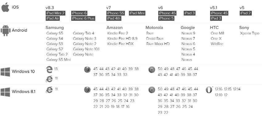
Compatibility
Logos
Variations
| ID | Code example | Visual example | Guideline |
| No Tagline Colour |
<img src="https://ui.rightmarket.com/logos/RightMarket-Logo-No-Tagline-Colour.png" alt="RightMarket Logo">
|
 |
This is the master logo and should be used when possible. |
| No Tagline White |
<img src="https://ui.rightmarket.com/logos/RightMarket-Logo-No-Tagline-White.png" alt="RightMarket Logo">
|
 |
TBC |
| Tagline Below Colour |
<img src="https://ui.rightmarket.com/logos/RightMarket-Logo-Tagline-Below-Colour.png" alt="RightMarket Logo">
|
 |
TBC |
| Tagline Below White |
<img src="https://ui.rightmarket.com/logos/RightMarket-Logo-Tagline-Below-White.png" alt="RightMarket Logo">
|
 |
TBC |
| Tagline Right Colour |
<img src="https://ui.rightmarket.com/logos/RightMarket-Logo-Tagline-Right-Colour.png" alt="RightMarket Logo">
|
 |
TBC |
| Tagline Right Colour |
<img src="https://ui.rightmarket.com/logos/RightMarket-Logo-Tagline-Right-White.png" alt="RightMarket Logo">
|
 |
TBC |
How to use
To reference a logo add the logo name to the following path:
https://ui.rightmarket.com/logos/RightMarket-Logo-No-Tagline-Colour.svg
To use a logo as a background image:
1. Reference the RightMarket front-end framework
							<!-- Latest compiled and minified RightMarket front-end framework -->

							<link rel="stylesheet" href="https://ui.rightmarket.com/framework.min.css">
2. Use the classes highlighted below:
<span class="rmui-logo"></span><span class="rmui-logo-black"></span><span class="rmui-logo-white"></span>
Sizes
| Class | Example | Guideline |
| .rmui-logo-size-small | |
TBC |
| .rmui-logo-size-medium | |
TBC |
| .rmui-logo-size-large | |
TBC |
How to use
To set a logo width:
1. Reference the RightMarket front-end framework
							<!-- Latest compiled and minified RightMarket front-end framework -->

							<link rel="stylesheet" href="https://ui.rightmarket.com/framework.min.css">
2. Use the classes highlighted below:
<img src="https://ui.rightmarket.com/icons/logo-black.svg" alt="Logo" class="rmui-logo-size-small">
<img src="https://ui.rightmarket.com/icons/logo-black.svg" alt="Logo" class="rmui-logo-size-medium">
<img src="https://ui.rightmarket.com/icons/logo-black.svg" alt="Logo" class="rmui-logo-size-large">
<span class="rmui-logo-black rmui-logo-size-small"></span><span class="rmui-logo-black rmui-logo-size-medium"></span><span class="rmui-logo-black rmui-logo-size-large"></span>
Tooltips
Usage
TBC
Example
Styling
| Class | Example | Style | Guideline |
| .rmui-tooltip-top | Tooltip text |
background-color: #55B4B0 font-size: 14px color: #FFFFFF padding: 5px 0 margin: 6px |
TBC |
| .rmui-tooltip-right | Tooltip text |
background-color: #55B4B0 font-size: 14px color: #FFFFFF padding: 5px 0 margin: 6px |
TBC |
| .rmui-tooltip-bottom | Tooltip text |
background-color: #55B4B0 font-size: 14px color: #FFFFFF padding: 5px 0 margin: 6px |
TBC |
| .rmui-tooltip-left | Tooltip text |
background-color: #55B4B0 font-size: 14px color: #FFFFFF padding: 5px 0 margin: 6px |
TBC |
How to use
1. Reference the RightMarket front-end framework
							<!-- Latest compiled and minified RightMarket front-end framework -->

							<link rel="stylesheet" href="https://ui.rightmarket.com/framework.min.css">
2. Use the classes highlighted below:
<div class="rmui-tooltip">
Right
<div class="rmui-tooltip-right">Tooltip text</div>
</div>
Forms
Coming soon!
Forms
Usage
TBC
Example
Styling
Search
Usage
TBC
Example
Styling
| Tag | Example | Style | Guideline |
| <input> |
|
Default background-color: #FFFFFFborder: 1px solid #C4C4C4 border-radius: 20px 0 0 20px color: #5E5E5E font-size: 16px height: 36px line-height: 36px max-width: 250px padding: 0 15px transition: all 0.3s ease width: 100% On focus border: 1px solid #55B4B0 |
|
| <button> |
|
Default background-color: #F7941Eborder: 0 none border-radius: 0 20px 20px 0 color: #FFFFFF cursor: pointer font-size: 16px font-weight: bold height: 36px line-height: 36px margin-left: -5px padding: 0 15px transition: all 0.3s ease On hover background-color: #55B4B0 |
How to use
To add a search box:
1. Reference the RightMarket front-end framework
							<!-- Latest compiled and minified RightMarket front-end framework -->

							<link rel="stylesheet" href="https://ui.rightmarket.com/framework.min.css">
2. Use the class highlighted below:
<div class="rmui-search">
<input type="search">
<button>
</button>
</div>
Links
Usage
TBC
Example
Turquoise linkGrey link
Styling
| Class | Example | Style | Guideline |
| .rmui-link-turquoise | Turquoise link |
Default text-decoration: nonefont-size: 14px font-weight: normal color: #55B4B0 On hover color: #5E5E5E |
TBC |
| .rmui-link-grey | Grey link |
Default text-decoration: nonefont-size: 14px font-weight: normal color: #5E5E5E On hover color: #55B4B0 |
TBC |
How to use
1. Reference the RightMarket front-end framework
							<!-- Latest compiled and minified RightMarket front-end framework -->

							<link rel="stylesheet" href="https://ui.rightmarket.com/framework.min.css">
2. Use the classes highlighted below:
<a href="#tab1" class="rmui-link-primary">Primary link</a>
<a href="#tab1" class="rmui-link-secondary">Secondary link</a>
Tabs
Usage
TBC
Example
Styling
| Class | Example | Style | Guideline |
| .rmui-tab | border-bottom: 1px solid #55B4B0 | TBC | |
| .rmui-tab-selected | Tab1 |
background-color: #FFFFFF font-size: 14px font-weight: normal color: #5E5E5E padding: 15px border-top: 1px solid #55B4B0 border-right: 1px solid #55B4B0 border-bottom: 1px solid #FFFFFF border-left: 1px solid #55B4B0 border-radius: 20px 20px 0 0 |
TBC |
| .rmui-tab-unselected | Tab2 |
Default background-color: #FFFFFFfont-size: 14px font-weight: normal color: #5E5E5E padding: 15px border-top: 1px solid #55B4B0 border-right: 1px solid #55B4B0 border-bottom: 1px solid #55B4B0 border-left: 1px solid #55B4B0 border-radius: 20px 20px 0 0 On hover background-color: #C4C4C4 |
TBC |
How to use
1. Reference the RightMarket front-end framework
							<!-- Latest compiled and minified RightMarket front-end framework -->

							<link rel="stylesheet" href="https://ui.rightmarket.com/framework.min.css">
2. Use the classes highlighted below:
							<div class="rmui-tab">


								<a href="#tab1" class="rmui-tab-selected">Tab1</a>

								<a href="#tab2" class="rmui-tab-unselected">Tab2</a>

								<a href="#tab3" class="rmui-tab-unselected">Tab3</a>


							</div>